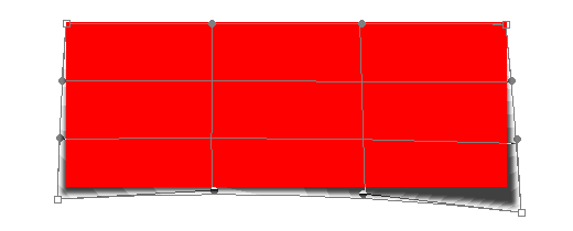
If you ever wanted to know how we did all of the super-cool shadows on the site, here is our step-by-step process.
Better Drop Shadows
We’ve gotten more than one question from curious creative types out there on the Web about how we achieved certain effects on our website. Lots of people want to know about the shadows, and I know why: far too many designers just use the craptastic default drop shadow settings in Photoshop. Why do you stick with something that looks so artificial when it’s not very hard to do something a little more photorealistic?
In an effort to make the Web a better place, I’m going to share my top secret techniques with you. Actually, my techniques aren’t all that secret. In fact, they are fairly well-documented, and if you spend about 28 milliseconds on Google, I’m sure you could find a much more in-depth article on creating spiffy realistic shadows. Either way, here goes.
First off, I’m using Photoshop, and while I’m sure this could probably be done in Fireworks or GIMP or any number of other image editing applications, you’ll have to figure those out on your own. Also, I’m using CS2 in particular, so if you’re using an older or newer version of Photoshop, the commands may be slightly different.
Ok, let’s get started. Fire up Photoshop and create a new file. What you need is to create some kind of shape or image on its own layer, but you can do that however you want: with the Shape tool, by creating a selection and filling it in with a color, by pulling in an image from another file, etc.
Next, give your groovy new item a drop shadow. If you don’t know how to do that, click on Layer, then Layer Styles, then Drop Shadow— or click on the layer styles icon (a little F in a black circle) on the bottom of the Layers palette. You’ll be presented a whole lot of settings that you can tweak, but the only ones I usually touch are the opacity and the angle. Depending on what color background your image has, the default shadow opacity may be too dark or too light. Also, the default angle needs to somewhat match the lighting source used in the rest of your image. For OnWired.com, I always used 90 degrees — straight up at top center. Many people have the tendency to change the distance, spread, and size, but I wouldn’t suggest it. I’ll tell you why later. At this point, you should have some kind of image that resembles this:

Congratulations! You’ve got a shadow!
Looks pretty lame, right? I know it does, but just trust me — this is how the magic happens.
Next, if you look at your Layers palette, the layer with your groovy artwork should show that wacky little F icon with an arrow next to it. Click on it and the list of currently applied layer styles will expand. You’re looking for the one called Drop Shadow. Right-click on it, then on the menu that appears, click on Create Layer. If you get a little error message saying “Some aspects of the Effects cannot be reproduced with layers”, just click ok. Now, in your Layers palette, you should see your drop shadow on a layer of its own, probably with a great name like Layer 1’s Drop Shadow. Click on it.
Now, we want to warp that shadow. Click on Edit, then Transform, then Warp. Some gridlines and little handles will appear over your image. Just grab them and pull. You can stretch your shadow however you want, completely independent of the image it was associated with. For OnWired.com, in most cases, I stretched one or both corners down to create the illusion that the square image was floating above a curved background surface. Just experiment and you’ll find something that works for you.

Your shadow is now warped.
Why I do my shadows this way
That explains the technical how-to, but now let’s talk a bit about some of the practicalities and the psychology behind something like this. Designers started adding drop shadows to give designs the illusion of depth and to make things seem a little more realistic. However, when things don’t look quite right, particularly with lighting, the human brain gets a little freaked out. For example, most drop shadows you see are typically below and slightly to the right or left of the image. Try reversing it so that the the shadow is above the image. It seems weird, doesn’t it? To take it even further, put two items right next to each other and give them shadows going in different directions. Doesn’t that seem really unnatural?
Take a look at some real shadows. Put a sticky note on your desk so that it curls up a little bit and creates a shadow. Now look at it — I mean really look at it. What do you see? If it’s fairly close to the desk, the shadow is really crisp. As the sticky note moves away from the desk, the shadow starts to blur a little bit. The shadow doesn’t get really blurry until it’s a good inch or so above the surface of the desk. Remember when I said not to touch the distance, spread, and size in the drop shadow settings? This is why. Photoshop will let you create something completely unnatural. Next time, before fiddling with those sliders, take a minute and look at some real shadows. Try to create the look you want with some real paper, a real desk, and a real light and then reproduce that in Photoshop. It will look much more realistic, and in the long run, your finished design will look a lot better.
Latest posts by (see all)
- Outperform Your Competitor: 3 Solid Strategies For Your Website - March 11, 2020
- How To Drive Conversions With Content - February 18, 2020
- Top 8 Web Design Trends to Nail It in 2020 - January 20, 2020


Leave a Reply